Earlier this year, Richmond Foundation was given a brand new look by Brandwagon, as part of their CSR commitment.
Apart from commemorating our 25th anniversary of providing optimal community mental health services with a bang, we also wanted to make our Foundation and what we stand for more approachable for younger people.
The rebrand encapsulated much more than just the look and feel of the Foundation’s Communications – it trigerred a fundamental shift in our vision. Richmond needed to build a new model, and brand, which signifies a change in how Malta thinks about mental health.
Richmond’s message is that when dealing with mental health issues, recovery is possible – and more importantly, recovery is a process, a journey. So the colours chosen are positive, warm and easy on the eyes while also being bold, striking a balance between vibrance, and a sensible, human tone in the brand.

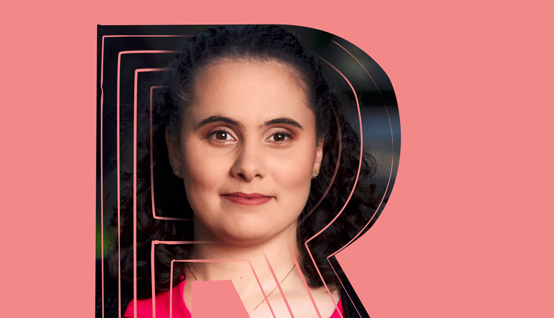
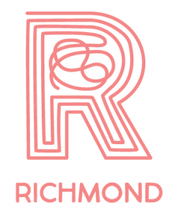
The logo itself was conceived with this in mind and comes to life when digitally animated. It starts from a place of confusion, signifying the effect a mental health issue would have on a person’s life. As the circumference grows, while imperfect, a path emerges from the confusion and grows to be more distinct. And as the lines reach the edge of the letter R, they become more aligned and lead to an exit, signifying the person’s independence, at the very top.
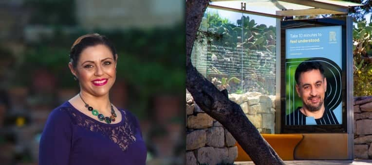
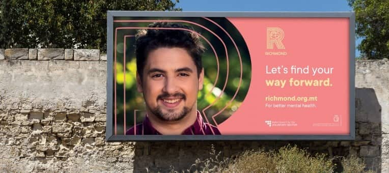
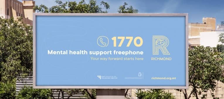
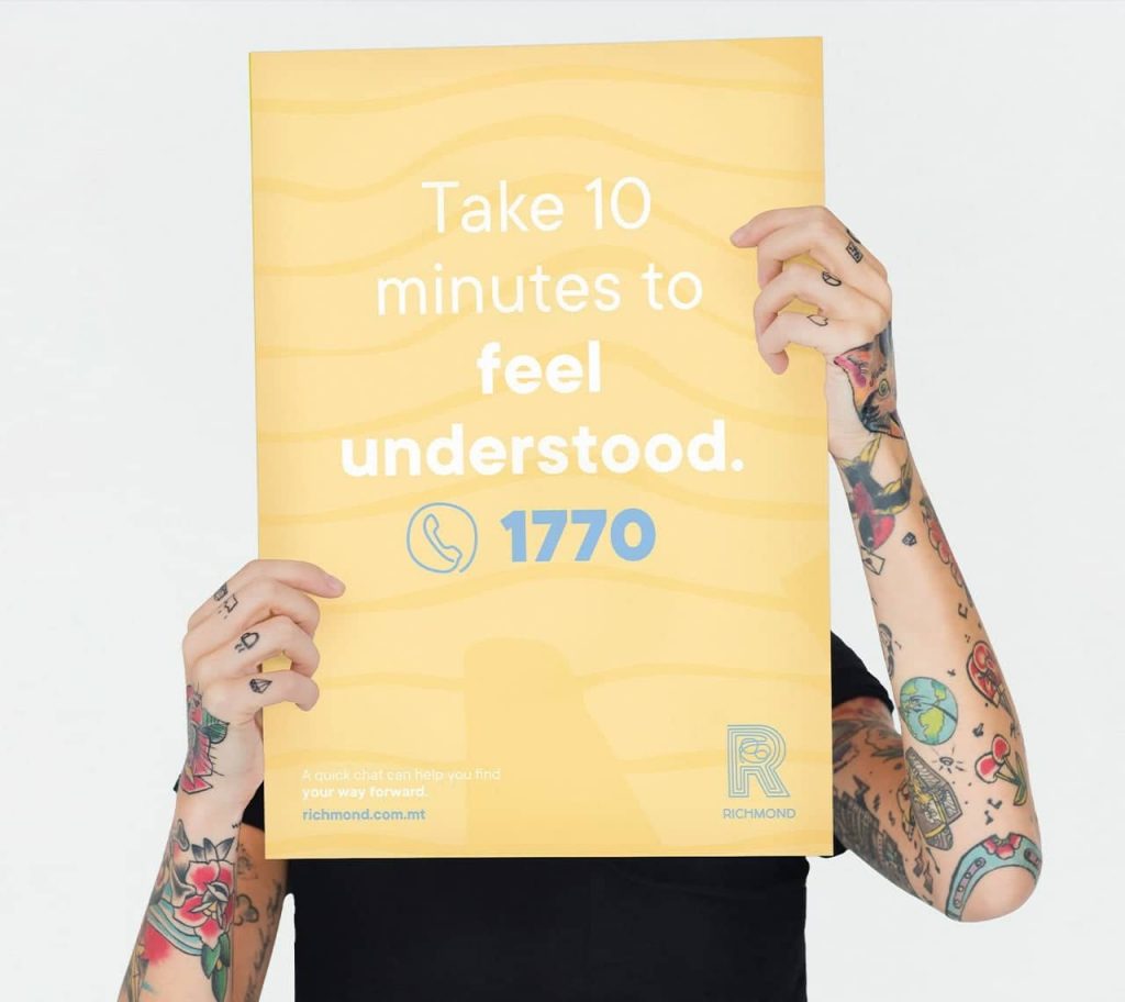
A key driver for our campaign with Brandwagon was authenticity. We featured real people who had used Richmond’s support to find their way to mental well-being. Our campaign concept ‘Let’s find you way forward’ communicated that Richmond will be by your side to help you get better, whatever your current condition or state of mind. The concept was supported by the messaging “Take 10 minutes to…”, which explains that meaningful change can start from a 10-minute call with us.
